11 October 2026/16 min read
From satellite image to flagged slope
How Watchberg reads alpine terrain, shown on the Blatten case: every step from open radar images to one flagged slope unit, with the data, the numbers and the limits. Also available as a white paper in PDF.
By Julian Walder
This article walks through the whole chain once, on one documented case: from the raw satellite images over the Lötschental to a map in which one unit of terrain is flagged, and to the evidence behind that flag. It is written for two readers at once. The main text uses plain words. The boxes marked "For specialists" carry the parameters, the numbers and the methods. Everything shown was computed after the event, from public data, on one laptop, in about one working day once the data access existed. The same text is available as a white paper: download the PDF. A three-page summary for media is available as well: media summary (PDF).
Three rules apply to everything below. First, this is a look-back at a documented past case, computed after the event. It is no assessment of any slope today. Second, the colours show a change in the rate of movement of a piece of terrain compared with its own past. They never predict when or whether something will fall. Third, the processing follows standard, published methods with every parameter recorded. Nothing was tuned to make the known outcome appear.
1. The case
On 28 May 2025 about 10 million cubic metres of rock and ice broke away from the Kleines Nesthorn and the Birch Glacier above Blatten in the Lötschental, Valais, and buried most of the village. About 300 residents had left their homes nine days earlier, after a local observer raised the alarm and the canton installed ground radar. The damage was put at about CHF 320 million.
Afterwards, two groups of researchers went back into the satellite archives. One used long-wavelength radar from the Japanese and Argentine satellites ALOS-2 and SAOCOM and found that the slope had been moving since 2016 or 2017, at about 50 centimetres per year by 2023 and more than 150 centimetres per year by August 2024. The other used the European Sentinel-1 satellites and found more than 60 millimetres of movement along the radar's line of sight, with a marked acceleration after April 2025. The long-wavelength archives are not open. The Sentinel-1 data are free to anyone.
The question this article answers is practical: with free data, open software and a standard method, what does the terrain around Blatten look like quarter by quarter from 2023 to the collapse, and what exactly does the slope's own history show?
2. The terrain: what the satellites look at
Every map here is drawn on real Swiss terrain. The elevation model from swisstopo gives the height of the ground every 2 metres. From it come the contour lines, the lines of equal height that make a mountain readable on paper: the closer the lines, the steeper the ground. The aerial image, also from swisstopo, shows what the valley and the slopes look like from above. Both are open government data and need no login.
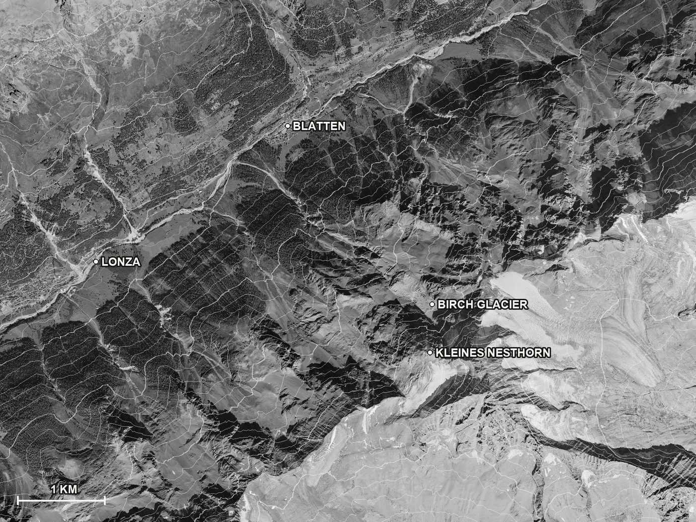 The area around Blatten from above: the swisstopo aerial image in greyscale with 100 m contour lines. The village lies in the valley at the top left; the Kleines Nesthorn and the Birch Glacier sit at the lower right, about 1,900 m above it. North is up, the bar shows one kilometre.
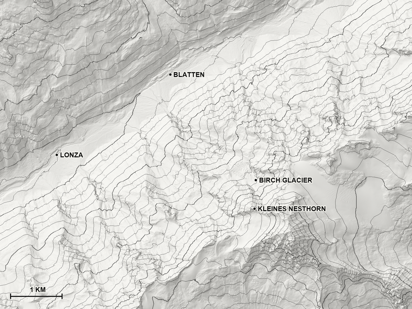 The same area as a contour map: a shaded relief with the 100 m contour lines. This is the version used for the quietest map style in the demo.
3. The satellite images: two wavelengths
A radar satellite does not take a photograph. It sends out pulses of radio waves and records what comes back. Rock, ice, forest and buildings each reflect differently, so the result is a picture of brightness in which steep slopes facing the satellite look compressed and bright, and slopes facing away fall into shadow. The satellite looks sideways, from an angle, which is why a radar image of mountains looks distorted to the eye.
Two kinds of radar matter for alpine terrain. The European Sentinel-1 satellites use a short wavelength of about 5.6 centimetres (called C-band). It gives sharp images every few days, but snow, vegetation and fast movement scramble its signal easily. The NISAR satellite, launched by NASA and India's ISRO in 2025 with free data since July 2026, uses a wavelength of about 24 centimetres (called L-band). It sees through dry snow and tolerates rougher and faster-moving ground. For the look-back only Sentinel-1 exists, because NISAR had no data before June 2026. The L-band image below is from September 2026 and is shown for comparison only.
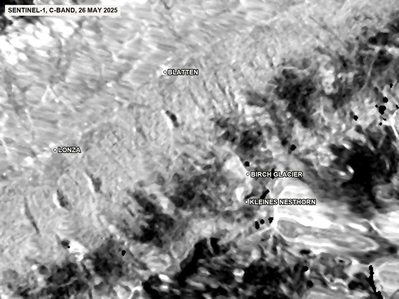 Sentinel-1, C-band: radar brightness of the image of 26 May 2025, two days before the collapse. The valley floor is dark, the rock faces that face the satellite are bright and look compressed. This is how short-wavelength radar sees the mountains.
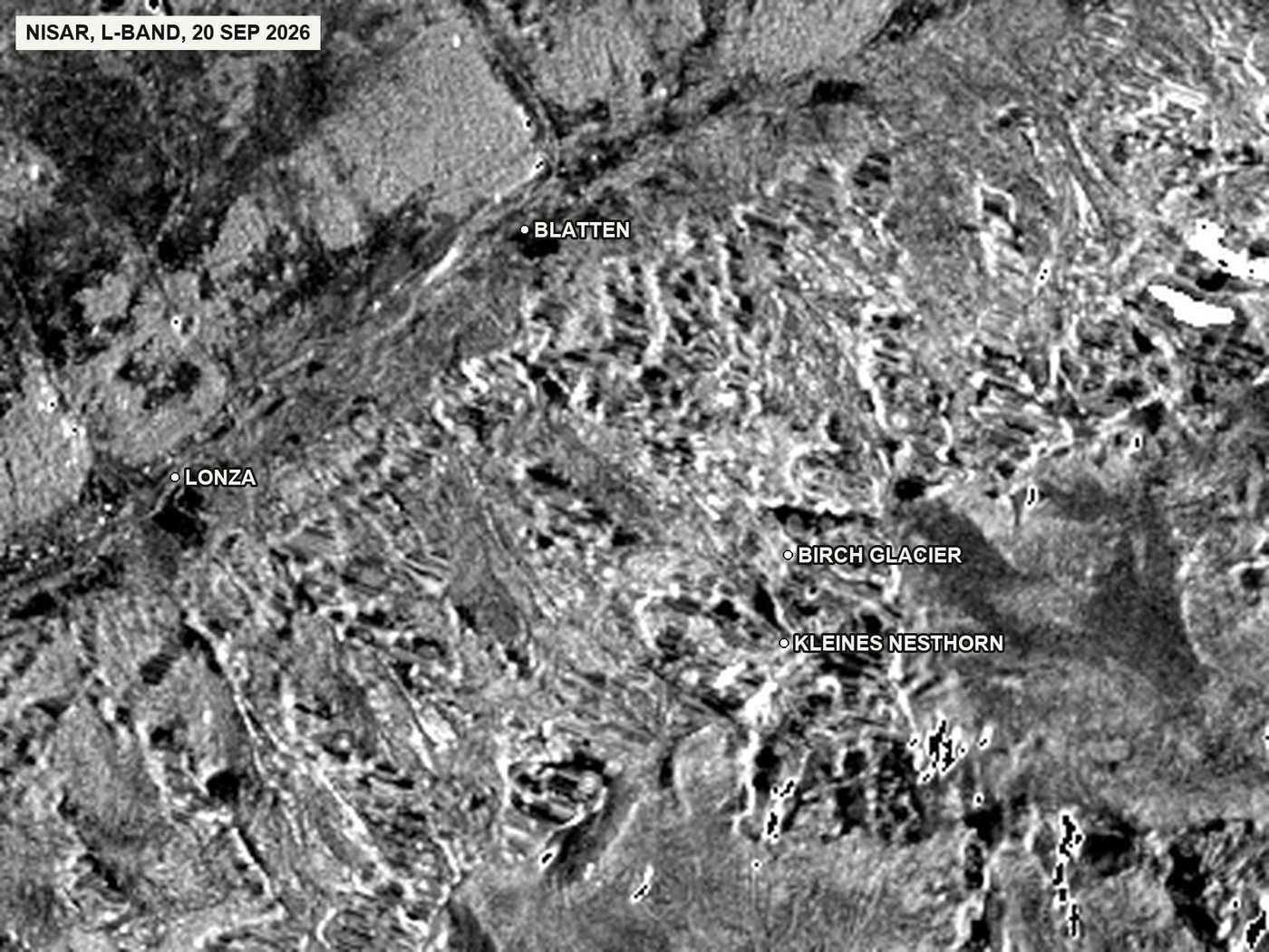 NISAR, L-band: radar brightness of the image of 20 September 2026, 20 m detail. The longer wavelength shows the terrain more evenly, including the snow and ice at the lower right. Shown for comparison only; no assessment is made from it.
Four Sentinel-1 tracks pass over Blatten, two looking from the east on their way south and two looking from the west on their way north. Each track imaged the slope every 12 days during the two and a half years before the collapse, about 75 times per track.
4. Comparing two images: the interferogram
Movement cannot be seen in one radar image. It appears when two images of the same place, taken days apart, are compared. The radar wave travels to the ground and back; if the ground moved by a fraction of the wavelength between the two passes, the returning wave arrives slightly out of step. Plotted as colour, these shifts form bands called fringes. One full cycle of colour means 2.8 centimetres of movement towards or away from the satellite, plus whatever the atmosphere and the terrain itself add.
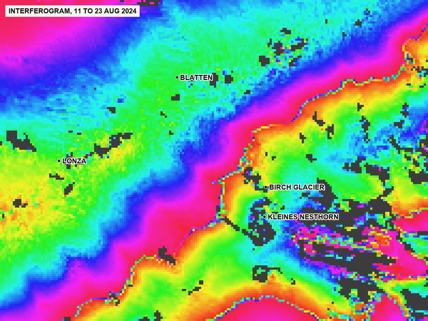 Interferogram of the images of 11 and 23 August 2024 on track 139. Each full colour cycle is 2.8 cm of movement towards or away from the satellite, mixed with atmospheric and terrain effects. Grey: the signal between the two images is lost, typically on snow, ice, forest and very steep faces.
The grey areas are the first honest limit. Where the surface changed too much between the two images, through snow, vegetation, or motion of more than a few centimetres, the comparison fails. Scientists call the quality of the comparison coherence. Before processing two and a half years of data, a short test decided which track to use: ten summer pairs on the track looking from the east and ten on the track looking from the west.
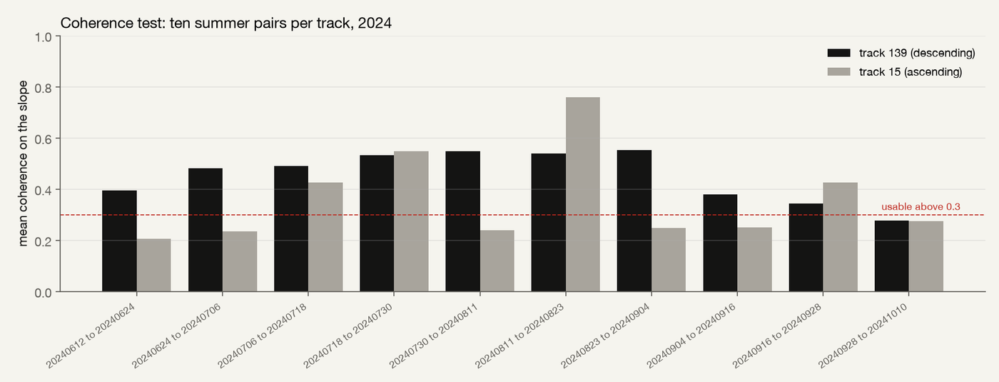 Coherence test: mean coherence on the Kleines Nesthorn slope for ten summer pairs of 2024 on each candidate track. Track 139 (looking from the east) keeps a usable signal in every pair; track 15 (looking from the west) loses it in half of them.
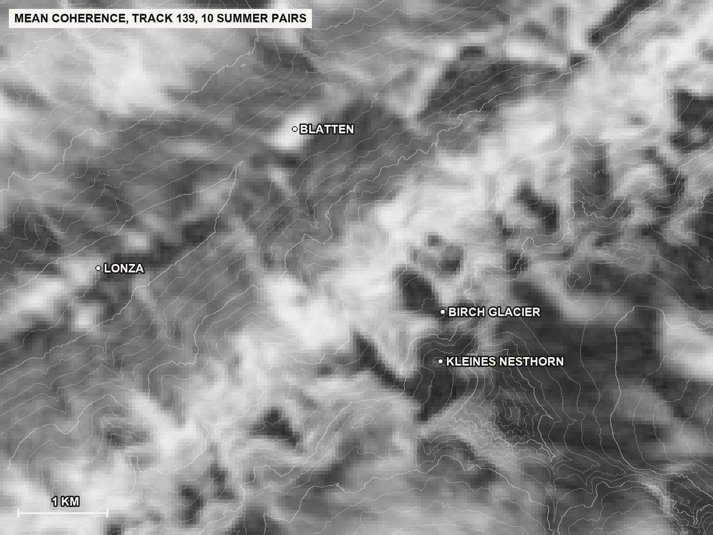 Mean coherence over the area for the ten test pairs on track 139, bright is good. The valley and the lower slopes are usable, the glacier and the highest faces are not.
5. From pairs to a movement history
One interferogram shows the change between two dates. To get a history, many pairs are chained: image 1 with image 2, image 2 with image 3, and also image 1 with image 3 to bridge gaps. The software then solves for the movement of every pixel at every date, like reconstructing a journey from many overlapping legs. Winter pairs with little usable signal are dropped before the solving. The result is a time series: for every 40 m pixel, a line of movement values, one per satellite image.
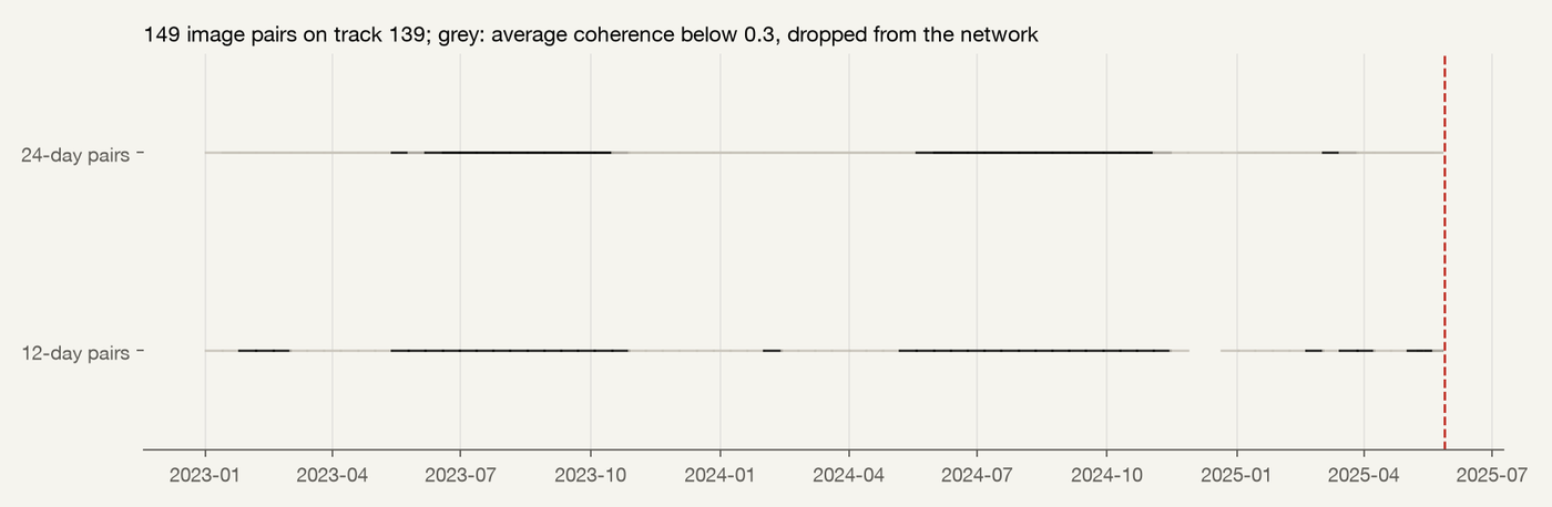 The network of 149 image pairs on track 139 from January 2023 to 26 May 2025. Grey pairs have an average coherence below 0.3 and were dropped; 100 pairs were kept for the inversion.
Two more corrections are standard. The atmosphere delays the radar signal differently over valleys and peaks, which looks like movement; a height-dependent correction removes most of it. A slight tilt across each image, from orbit and atmosphere, is removed as a plane. Finally, a quality measure called temporal coherence says for each pixel how consistently the chain of pairs agrees. Only consistent pixels are used; for this area that is a little under half of the window, and it excludes the glacier and the fastest, roughest part of the Kleines Nesthorn.
Three maps show where the data can be trusted, and why that is a matter of scale.
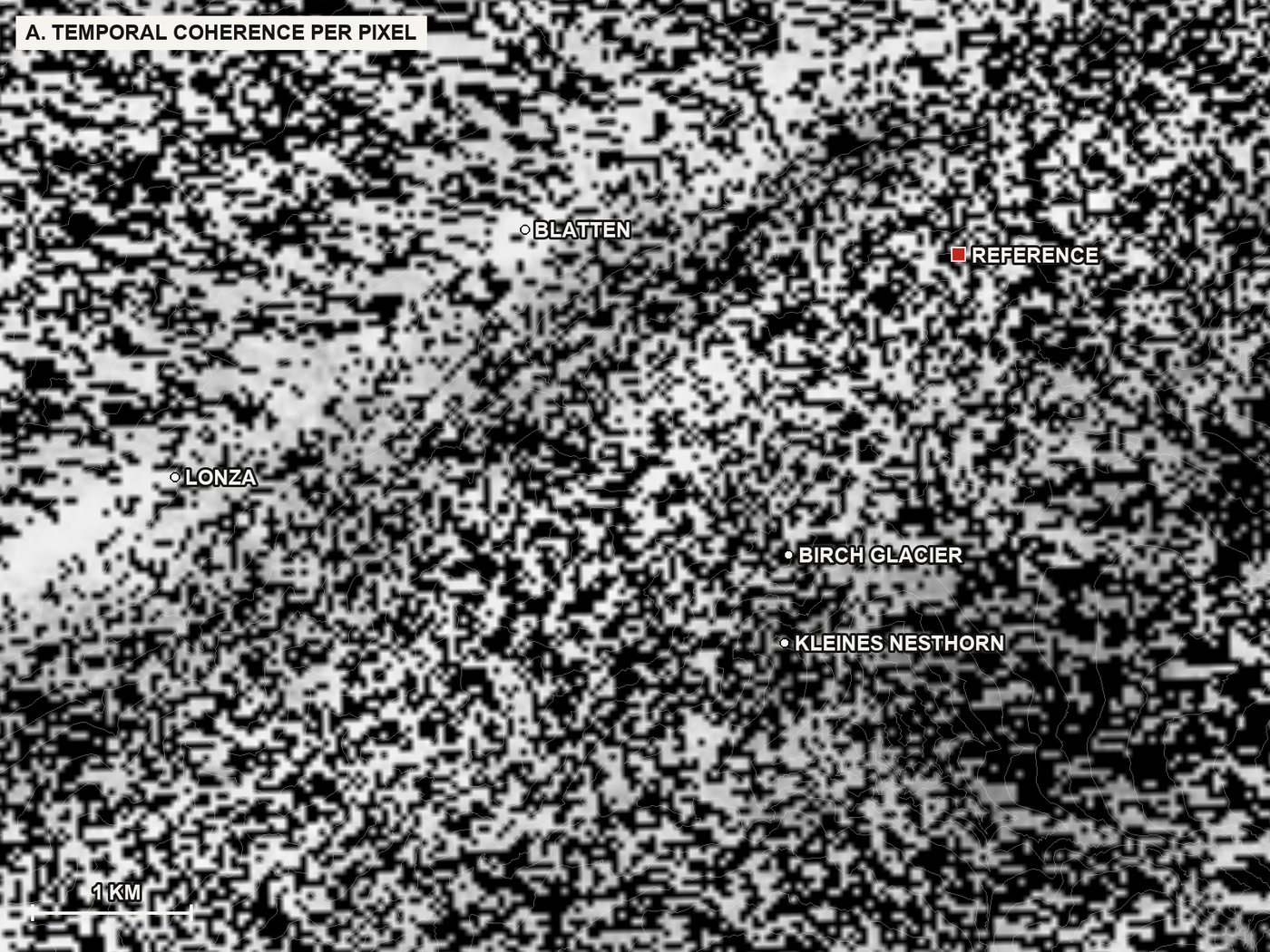 A. Temporal coherence, per 40 m pixel: how consistently the chain of image pairs agrees at that pixel, from 0 (black) to 1 (white). Pixels at or above 0.5 are used. It looks like static because consistency is decided pixel by pixel: the valley and the lower slopes pass, the glacier, the forest and the steep faces mostly fail. The red square is the reference point, a stable pixel against which all movement is measured.
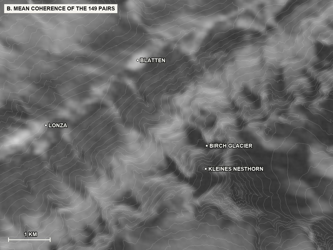 B. Average coherence over all 149 image pairs: how similar the ground looked to the radar between two passes, on average over the whole period. Bright where the radar works year-round (valley floor, bare rock, buildings), dark on ice, forest and the faces in shadow. This map says where a signal can exist; map A says where it survived the whole chain.
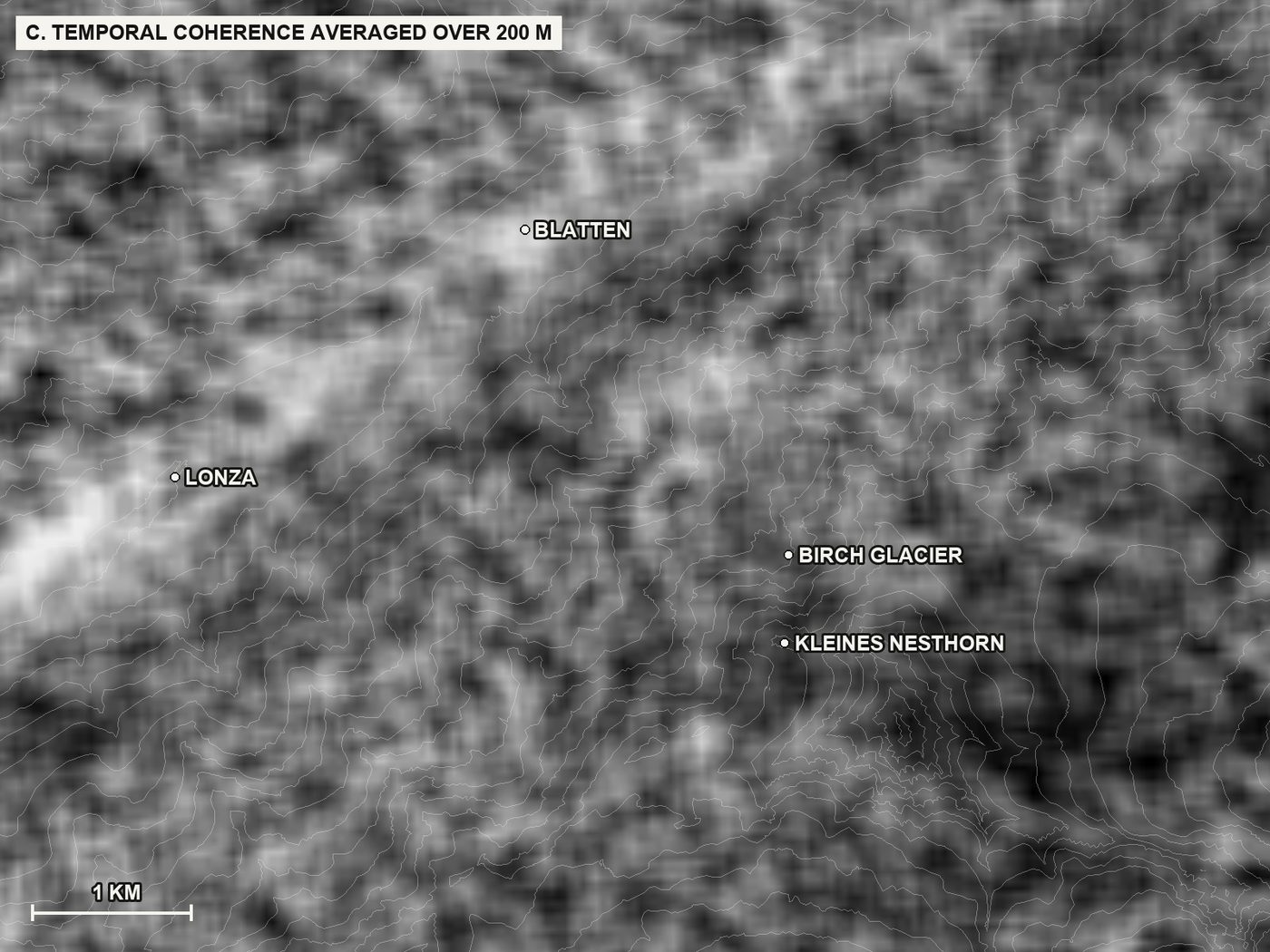 C. The temporal coherence of map A averaged over 200 m. This is the pattern at the scale of the 640 m units used for the classification: a unit needs enough consistent pixels, which is why the glacier and the highest faces appear hatched on the class maps.
6. Normal versus now: how a piece of terrain gets a colour
The core idea of Watchberg is simple: a slope is compared with its own past, never with a fixed speed limit. Glaciers flow, rock glaciers creep, deep slopes slide a few centimetres a year, and have done so for centuries. None of that is news. The signal is a slope that starts to move faster than it used to.
For the map, the window is divided into units of 640 by 640 metres, roughly the size of a slope section a geologist would talk about. For each unit, the movement history is the median of its usable pixels. From it come two rates: the normal rate, fitted over the whole of 2023, and the recent rate, fitted over the 180 days before the end of each quarter. The ratio of the two gives the colour: within 1.2 times the normal rate, no colour; up to 1.5 times, pale yellow; up to 2, yellow; up to 3, orange; above 3, red, which the dashboard calls "flagged for expert review". A colour is only shown when the change is statistically clear and when it was already visible in the previous quarter, so a single noisy quarter cannot flag a unit on its own. Units without a usable signal are hatched.
 The colour classes used on the map.
 Five quarters of the look-back, each with the 180-day window ending at the quarter's end: autumn 2023, winter 2024, autumn 2024, winter 2025 and the quarter of the collapse. Summer quarters are almost blank; winters show pale yellow where snow affects the short-wavelength signal; in the final quarter one unit at the Birch Glacier below the Kleines Nesthorn turns red, with yellow units around it.
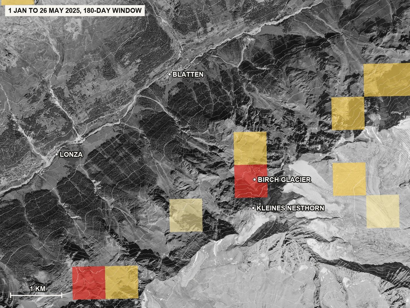 The final quarter in full: 1 January to 26 May 2025. The red unit sits on the Birch Glacier and the rock slope below the Kleines Nesthorn, the slope that failed four days after the last image. A second red unit at the lower left is a different slope; the look-back makes no statement about it beyond what the colour means: a rate of movement well above its own 2023 rate during that window.
One more detail matters for alpine terrain. Snow affects the radar signal differently at 1,500 and at 3,000 metres, so a unit's movement is measured relative to coherent terrain at the same elevation, in bands of 200 metres. A high slope is compared with other high slopes, which removes the seasonal effect that would otherwise colour whole mountainsides every winter.
7. The evidence: what the slope did
The map answers "where to look". The evidence behind a flag is the unit's own history. For the Kleines Nesthorn, the chart below shows the median movement of the part of the slope with a usable signal, relative to terrain at the same elevation, one point per satellite image.
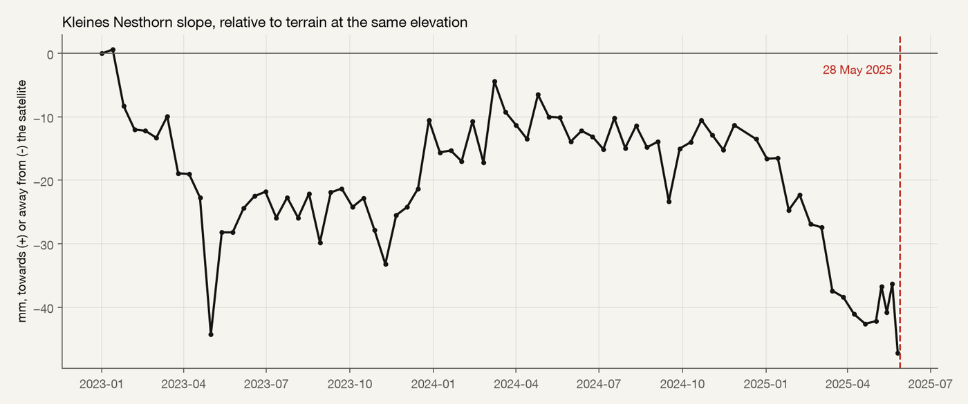 Median movement of the usable part of the Kleines Nesthorn slope (311 pixels of 40 m in a 600 m circle between the summit and the glacier front), relative to 11,862 coherent pixels at the same elevations. Negative values are movement away from the satellite. The dashed line marks 28 May 2025.
Through 2023 the slope settles at 20 to 25 millimetres away from its peers and stays there. Through 2024 it holds between 10 and 15 millimetres. From January 2025 it moves away again, by a further 25 to 30 millimetres in five months, and the last image before the collapse is the lowest point of the whole record. This is a modest signal, measured on the slower, coherent part of the slope, and it is consistent in direction and size with the published Sentinel-1 analysis of the same case. The fastest part of the slope, which the long-wavelength archives saw moving at more than 150 centimetres per year, is invisible to the short wavelength and appears hatched on every map.
8. What this shows, and what it does not
It shows that the chain works end to end with open data: terrain, radar images, pairs, a movement history, a comparison of each unit with its own past, a sparse map and a slope-level record, all reproducible from the recorded parameters. It shows that short-wavelength radar, on its own and in a quick standard processing, sees the slower part of the Blatten slope moving away in the months before the collapse, and does so without being told where to look.
It does not show the fastest part of the slope, which only the long wavelength can follow. It does not give a date; the final acceleration of a rock-ice mass plays out in hours and belongs to ground instruments. It is a look-back with knowledge of the outcome, which is exactly why every parameter is recorded and why the same method must be run on data that were available at the time, with no look-ahead, before any claim about lead time is made. The winter false flags, kept at bay here by the significance test and the persistence rule, are a real property of C-band in the Alps.
The product goes beyond this look-back in four ways, all of them projected until the 2027 pilot programme validates them: it combines the long wavelength of NISAR with Sentinel-1 so that the fast and snowy terrain keeps a signal; it runs automatically after every new image instead of once; it ranks the flagged units by what lies below them; and it hands the expert the evidence report behind each flag on a dashboard, with the data gaps stated.
9. Reproducibility and sources
Data: Copernicus Sentinel-1 (contains modified Copernicus Sentinel data 2023 to 2025), processed with ASF HyP3 and MintPy; NISAR GCOV (NASA and ISRO, via ASF); swissALTI3D and SWISSIMAGE (swisstopo). Software: HyP3 SDK, asf_search, MintPy 1.6.4, GDAL 3.13, Python. All processing ran on one laptop; the HyP3 jobs ran on ASF's servers for about 90 minutes. The scripts and parameter files are available on request.
- ESA, Satellite radars reveal early signs of slope instability years before Blatten rock-ice avalanche (MODULATE project), August 2025: https://eo4society.esa.int/2025/08/08/satellite-radars-reveal-early-signs-of-slope-instability-years-before-blatten-rock-ice-avalanche/
- Sentinel-1 small-baseline analysis of the Blatten slope, Journal of Rock Mechanics and Geotechnical Engineering, 2026: https://www.sciencedirect.com/science/article/pii/S1674775526002921
- ASF HyP3 documentation (products, options, credits): https://hyp3-docs.asf.alaska.edu/
- ASF notebook, HyP3 InSAR stack for time-series analysis with MintPy: https://github.com/ASFHyP3/hyp3-docs/blob/main/docs/tutorials/hyp3_insar_stack_for_ts_analysis.ipynb
- MintPy, small-baseline InSAR time-series software: https://github.com/insarlab/MintPy
- NISAR data at ASF: https://nisar-docs.asf.alaska.edu/
- swisstopo open data, swissALTI3D and SWISSIMAGE: https://www.swisstopo.admin.ch/en/terms-of-use-free-geodata-and-geoservices
- Copernicus Sentinel data legal notice: https://sentinels.copernicus.eu/documents/247904/690755/Sentinel_Data_Legal_Notice
- Geopraevent, Blatten and Kleines Nesthorn monitoring, 2025: https://www.geopraevent.ch/project/blatten-kleines-nesthorn/?lang=en
- SRF, 320 million francs of damage after the Blatten rockslide, 2025: https://www.srf.ch/news/schweiz/felssturz-und-ueberschwemmungen-320-millionen-franken-schaden-nach-felssturz-in-blatten
- Blatten
- Method
- Sentinel-1
- White paper